


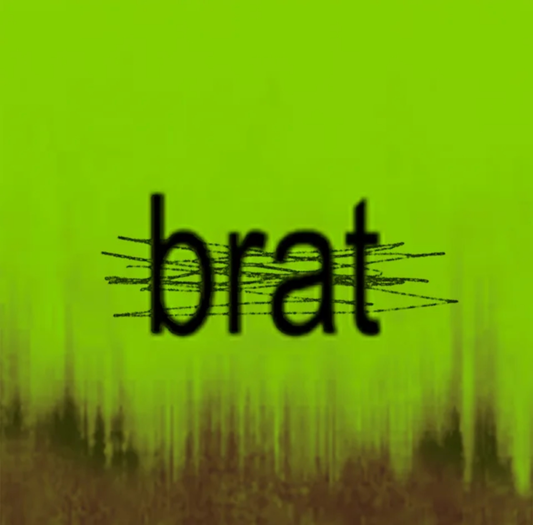
If you have been keeping up with Charli XCX, you probably noticed that something is off about her BRAT album’s cover lately. The once vibrant, neon green square with the blank phrase “brat” logo has taken on a whole new look. It’s scarred, rusty, and looks worn down. The pristine, bold design that kicked off the era is now distressed, and this change feels more than a visual update. It could be a sign that Chalri is wrapping up the BRAT chapter.
The BRAT era, which started off in 2024, created a sharp, distinct style. It had a raw, unpolished feel and gave a clear statement. But with this new, scratched-up version of the album’s artwork, Charli may be signaling that this phase is coming to an end. Rust usually shows that time has passed and that things are breaking down.
Artists like Kehsa often tweak their visuals as they transition from one era to the next, and Charli is no exception. This kind of visual shift is usually more than an aesthetic, it’s often a reflection of where the artist is mentally or creatively. So when she releases artwork that looks worn out or damaged, it might represent the strain of keeping up a certain image or energy. The BRAT identity she’s been leaning into for the past year might not be something she wants to carry forward forever.
At the same time, this change also suggests growth. Charli has never stayed in one area for too long; she is known for reinventing herself, and this could be her way of clearing space for a new direction. Just as BRAT felt like a fresh shift when it released, the visual update might be hinting at a new direction. The scuffed-up look could be a way of showing how her approach has shifted with time.
So is this Charli’s way of closing the BRAT chapter? It’s hard to say for sure, but the updated artwork feels like a sign that something is winding down. Still, knowing how she works, it probably won’t be long before something new takes its place.