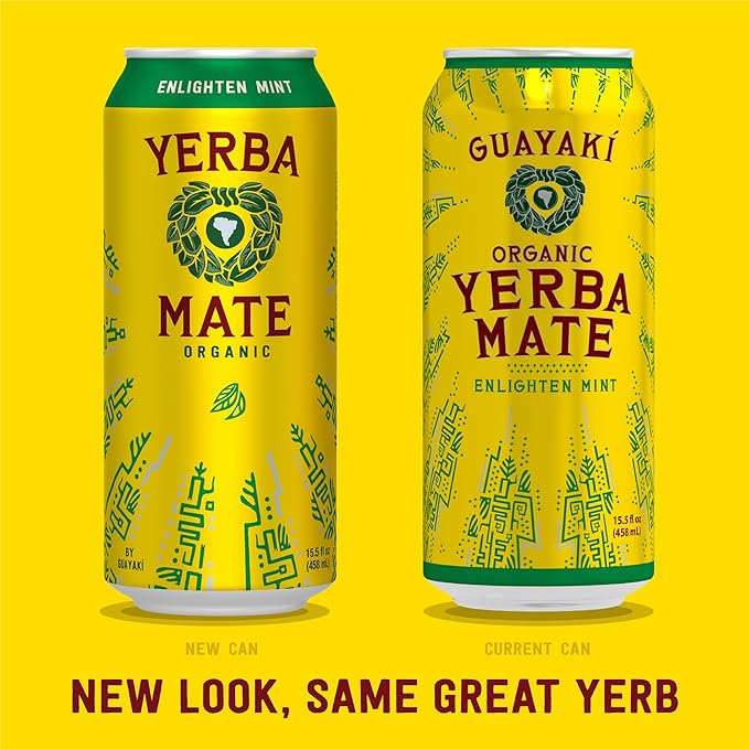
Guayakí is in the process of rolling out a new can design for their most popular drink. The updated cans feature a streamlined style and a bright band around the top displaying the flavor. This replaces the previous, more intricate design, with each flavor having a unique pattern.
Many yerba drinkers feel blindsided by this switch and do not support the new look. A negative response from consumers was immediate despite the quiet integration of the new can.
“I liked the old design better,” sophomore Nehla Espiritu-Blackstone said. “It was much more nice and cohesive.”
There are reasons why companies like Guayakí might change the design of their products. One might be to strengthen the brand image so a product may better represent the company’s identity. Guayakí has a naturalistic and regenerative history; they strive to create a net positive impact on society through their work. This is reflected in the company’s visual aesthetics, which has been so since its founding in 1996. However, AHS students think Guayakí missed the mark on this redesign, as it does not hold the same unique and natural qualities as the original can.
“They just look like every other energy drink,” senior Charlotte Brands said. “They took away the character.”
Another possible reason for the design change is visibility. The bold band clearly shows which yerba flavor somebody is grabbing, increasing the product’s accessibility. The color that represents each flavor was less apparent on the old cans.
The Guayakí website does not feature any information about the switch so far, and while there is pushback against the change, there is no evidence that suggests the old style will return anytime soon. Some encourage Guauakí to reconsider, like senior Madison Trieu.
“They messed up big time,” Trieu says. “Bring the other cans back.”


